Improving Maktabkhooneh’s shopping cart conversion
- Company / product
- Maktabkhooneh
- Role
- Product Designer
- Status
- Shipped
- Timeline
- July–August 2024 · 4 weeks
- Team
- 1 product designer, 1 product manager, 1 developer
- Tools
- Figma, Google Sheets, Microsoft Clarity, WebEngage
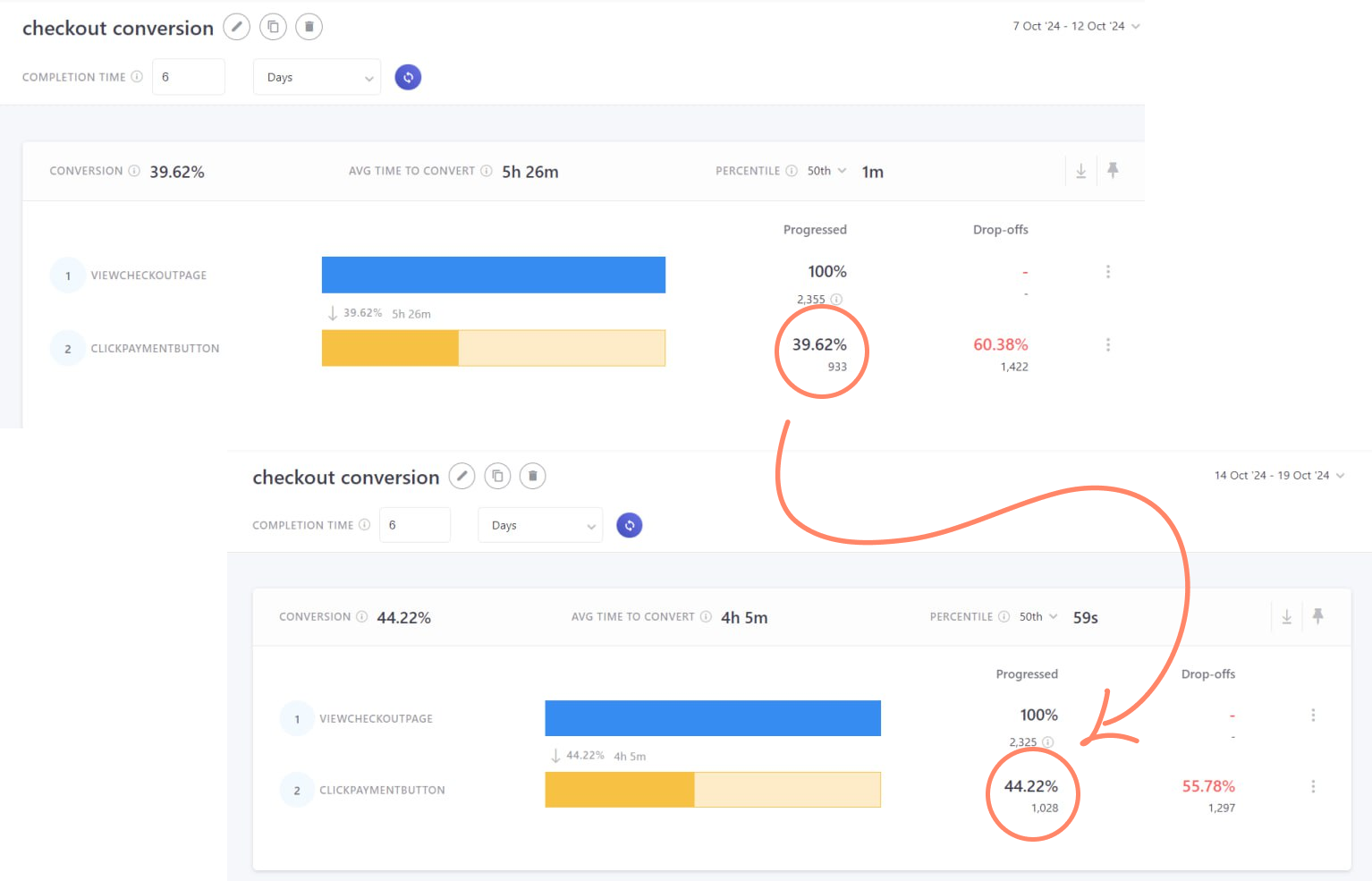
A research-led shopping cart redesign that reduced distractions and clarified the purchase action, raising conversion from 39.62% to 44.22%.
- conversion before
- 39.62%
- conversion after
- 44.22%
- conversion increasewithin one month
- +4.60 pp
An increase of 4.60 percentage points, not a 4.6% relative increase. Design timeline: July–August 2024; the supplied comparison screenshots show October 2024.
Goal & role
Help more learners complete their purchase
The goal was to improve a cart conversion rate of approximately 39%. I collaborated with a product manager and a developer to identify friction, test solutions and monitor conversion.
My work covered user interviews, personas, usability testing and behavior analysis through Microsoft Clarity recordings and heatmaps. WebEngage surveys and conversion tracking connected the research to business results.
Research
Seven interviews and around 200 survey responses
Over four days, I contacted 15 users by phone and completed seven interviews. Open-ended questions explored their values, motivations and course-purchase habits.
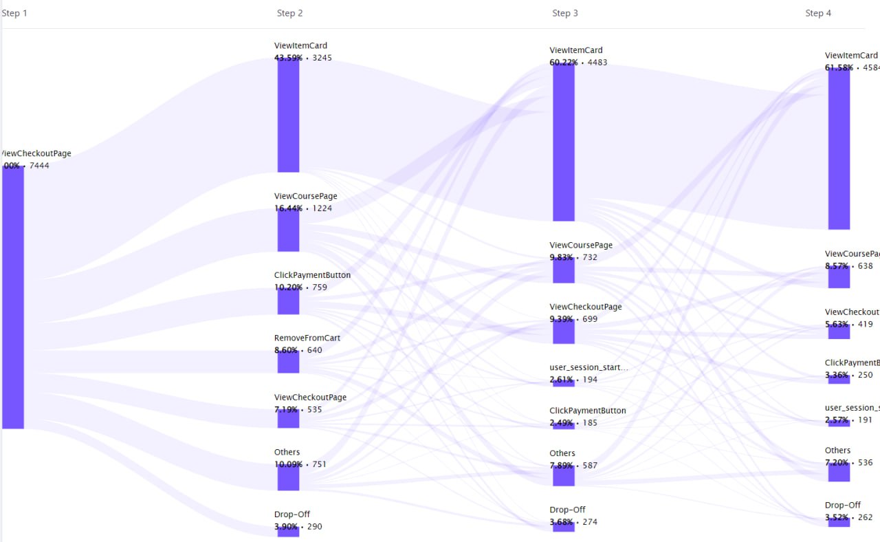
After observing repeated cart-item removals, we surveyed around 200 participants through WebEngage. We asked whether price, course content, timing, a more suitable course or discount-code issues had influenced their decision.
Personas
Six ways learners approached a purchase
We created six personas from interviews and surveys, updating them as new evidence emerged.
- Discount Seeker
- Course Researcher
- First-Time User
- Impulse Buyer
- Bargain Hunter
- Return Visitor
Usability findings
Unclear actions and distractions compounded purchase concerns
Research identified six issues behind item removal and cart abandonment. Usability sessions highlighted an unclear purchase action and distracting content that drew learners away from checkout.
- High course prices
- Discount-code issues
- Timing preferences
- Content quality concerns
- Page distractions
- Unclear purchase action
Design decisions
A clearer action, a quieter cart
- 01
Make the purchase action more prominent
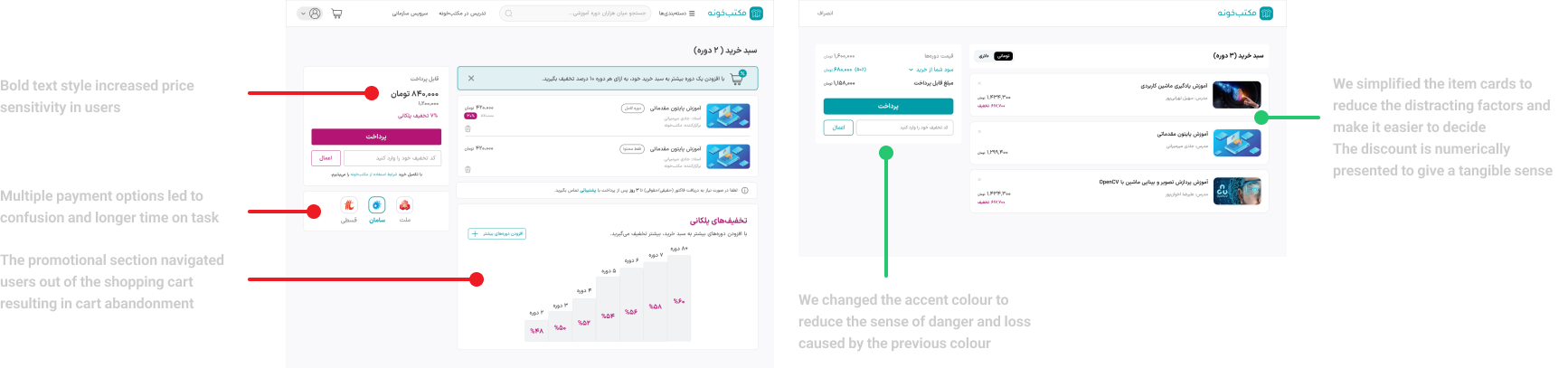
Clarify the next step and change the accent color to reduce the sense of danger and loss associated with the previous color.
- 02
Remove distractions from checkout
Promotional content sent users out of the cart, while multiple payment options caused confusion and longer time on task. The redesign focused attention on essential actions.
- 03
Simplify course cards and price presentation
Reduce competing information, make course choices easier and show discounts numerically so the savings feel tangible.
Results
From 39.62% to 44.22% conversion
The redesigned shopping cart increased conversion by 4.60 percentage points. My CV reports this improvement within one month.
The supplied conversion screenshots compare October 7–12 with October 14–19, 2024. These reporting dates are separate from the four-week design timeline.
Learning & next steps
Pair qualitative feedback with quantitative evidence
Small design changes, grounded in user insights, can improve conversion. Combining interview feedback with behavior data helped us address real pain points, while close cross-functional collaboration kept decisions connected to measurable outcomes.
We split solutions into two implementation phases. A future iteration would let learners select their learning start date to address timing concerns; this is a planned improvement, not a shipped result.
Broader contribution
Beyond the shopping cart
During my time at Maktabkhooneh (February 2022–January 2025), I also redesigned product cards, increasing click-through rate by 70% within a year, and revamped the student dashboard, reducing account-related support tickets by 30%.
I designed 14+ campaign landing pages, a Maktab Business employee-learning management panel and an instructor panel for creating, publishing and tracking course performance and sales. These are separate projects, not outcomes of the cart redesign.